Wires & Books
Binding Fialleril’s “everything I have ever learned”
- Completion Date
- October 2022
- Author
- fialleril
- Work
- everything I have ever learned
- Fandom
- Star Wars Original Trilogy
- Printing
- HP Color Laserjet MFP M283cdw / HP Premium 32 paper
- Binding
- Single-signature sewn (5.5 in x 8.5 in)
- Font
- Domitian by Daniel Benjamin Miller
- Software
- LuaLaTeX (memoir class for interior, bookcover for cover)
It took me a long time to get back into fic typesetting after 2006. After a few failed attempts, I decided to start somewhere smaller. “everything I have ever learned” is a short story (12,717 words) by fialleril, using their rich Tatooine worldbuilding to tell a character study of Luke Skywalker and recontextualize his actions across the arc of the Original Trilogy.
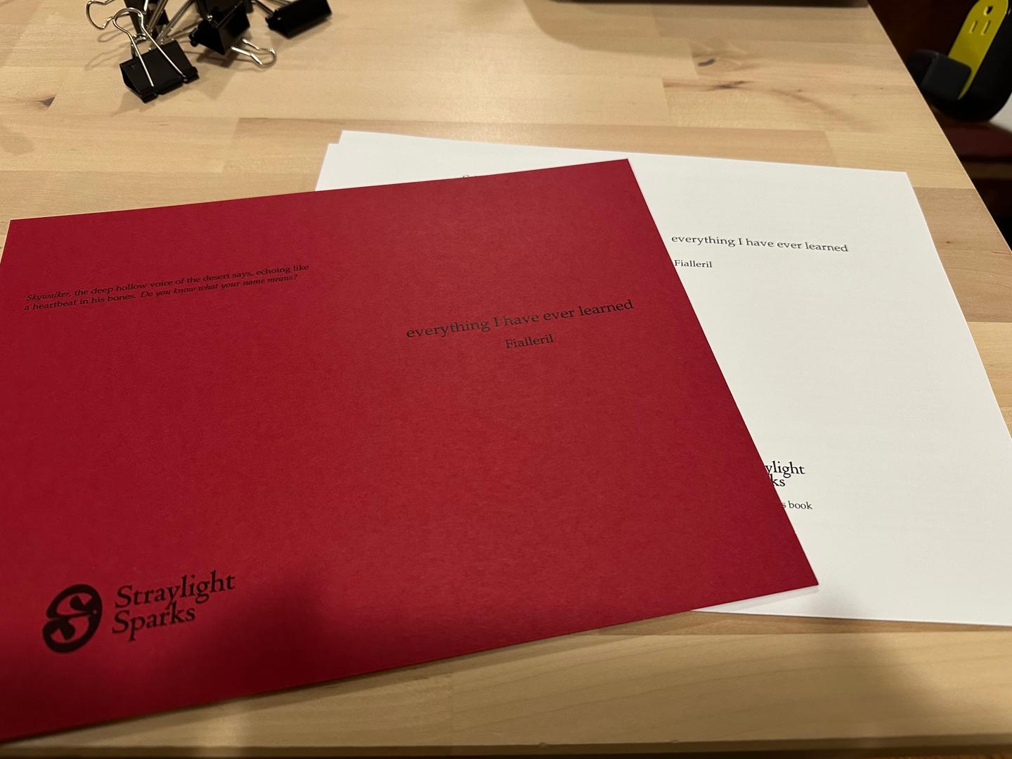
Design choices were driven by the constraints of the material at hand. (In retrospect, this was a mistake; the paper is a nice weight for individual pages, but too heavy for folded signatures.) I used the laser printer I already owned, with the letter-sized paper that was already loaded in it. For a cover, I stopped in at the paper shop around the corner from my apartment and picked up the only red-colored cardstock they had.
Among the Amavikka, red symbolizes bedrock, and therefore strength, courage, survival, and endurance. Meanwhile, black, as a symbol of the night and of water, represents not only secrecy and freedom, but also agency and sacred power. These colors seemed appropriate for binding this fic. I’d originally wished to do a stencil graphic on the cover, with a black foreground and cutouts revealing the red underneath. The cutouts would have created an image of the funeral pyre Luke builds for his father at the end of Return of the Jedi. Unfortunately, my own artistic skills were not up to the task, and none of the artists I attempted to commission were interested in the job, so I ended up with a fairly plain but serviceable cover design.
Figuring out the page layout was a learning experience. The page size itself was determined by the paper I had on hand; US letter paper, folded once, becomes “statement paper”, 5.5 inches by 8.5 inches. I set the typeblock to be 7 inches by 4 inches, with the fore-edge margin 150% of the spine margin and the lower margin 150% of the upper margin, and I printed out a sample page. It didn't look right, but that was fine, I could just fix it by hand.


And then when I applied those changes that had seemed so good when marking it up, I hated the outcome. So I went back to basics.
Basics, in this case, means Robert Bringhurst’s The Elements of Typographic Style, specifically the chapter on “Shaping the Page”. It doesn’t have any specific recommendations, but it has a lot of detail about different page sizes, and eventually I decided a textblock built around the golden section would go well with the page size. Since the book is so short, page numbers are honestly a bit ornamental; accordingly, I centered them at the bottom of the page.
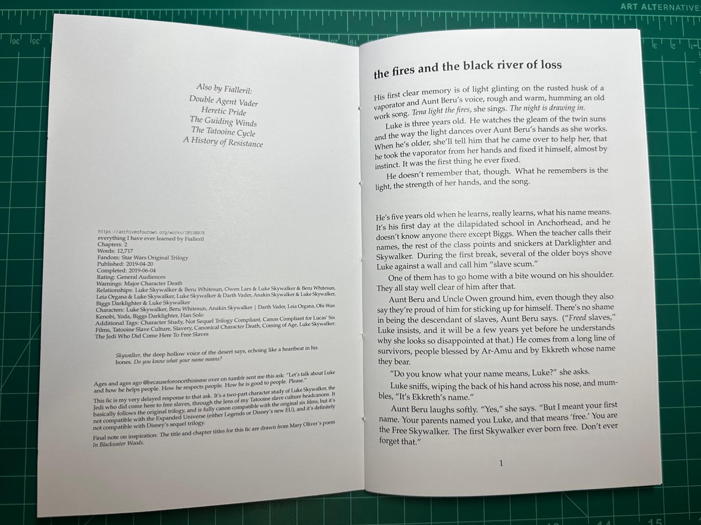
I placed all the AO3 metadata on the facing page before the fic proper, along with an “Also By” section. This is intended to mimic the front matter in a traditionally published book. Admittedly, normally the metadata (copyright statements, Library of Congress cataloging information, and so on) usually gets its own page, but this is a short book and page count is fairly constrained. I didn’t even have room for a half-title page!

The colophon at the end of the book lists the typeface (Domitian is much like Palatino), the software, and my name and publishing imprint. I also added this anti-capitalism notice:
The publisher wishes that no money be exchanged for copies of this volume, except for nominal sums to cover shipping & handling.
I gave the printing date and a printer’s key, since I intend to make multiple copies, and I would like to be able to distinguish various “printings” of the book. (Admittedly, the use of a printer’s key here is an affectation, since it will be simpler to just run off a new PDF with the changed metadata instead of manually removing a number from the key in the existing PDF, but sometimes an affectation is charming.)
After printing and punching, I stitched the book as a single signature using black thread, tying the knot on the outside for visibility. Because of the heavy paper weight, there was a fair amount of creep, which I ended up trimming away with a utility knife. The trim wasn’t as clean as I could have liked, but it worked, and I’ve learned for next time.
